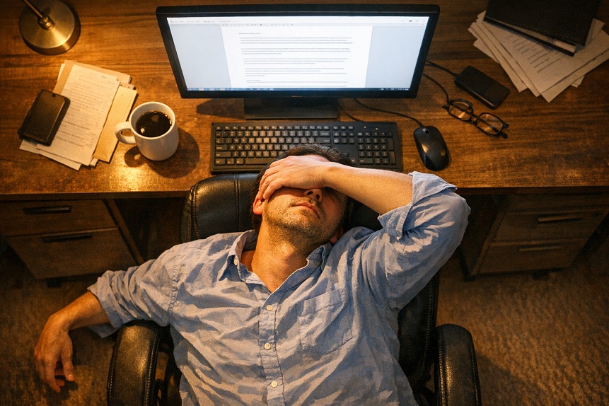
Most people set up a new monitor by plugging it in and accepting whatever the factory defaults happen to be. Those defaults are calibrated for visual impact in a showroom environment, which typically means high brightness, boosted contrast, and vivid color saturation. A monitor that looks impressive under harsh retail lighting tends to be unnecessarily aggressive for a day of sustained work in an ordinary office or home environment.
The gap between showroom settings and eye-friendly settings is not trivial. Brightness that is significantly higher than the ambient light in a room forces the eye to constantly adapt between the bright screen and the darker surroundings, which accumulates into fatigue over hours. Poor contrast ratios make text harder to resolve, increasing the effort required to read. Color temperature that skews too cool adds to glare sensitivity and, in the evening, disrupts sleep-regulating melatonin production.
The good news is that optimizing monitor settings for eye health costs nothing and takes about ten minutes. The adjustments below are ordered by the size of the impact they tend to produce, with the most consequential ones first.
Contents
- Brightness and Contrast: The Settings That Matter Most for Eye Strain
- Color Temperature Settings and Their Effect on Eye Comfort
- Screen Position, Size, and Viewing Distance for Reduced Eye Fatigue
- Text Size, Refresh Rate, and Other Settings Worth Checking
- Ten Minutes That Pay for Themselves Over Every Working Day
Brightness and Contrast: The Settings That Matter Most for Eye Strain
Of all the monitor adjustments available, brightness has the largest single effect on eye comfort during sustained screen use. Getting it right is the most important step you can take before anything else.
How to Set Screen Brightness Correctly
The principle is straightforward: your screen should be approximately the same brightness as the surfaces around it. A monitor that is significantly brighter than the room forces the eye to continuously readjust between the bright screen and the dimmer environment each time you glance away, a process called dark adaptation cycling that accumulates into significant fatigue over a long session. A monitor that is too dim relative to the room causes squinting and increased contrast demand.
A simple practical test: hold a white piece of paper next to your screen and compare. If the screen looks like a light source compared to the paper, it is too bright for your environment. If the paper looks noticeably brighter than the screen, the screen is too dim. They should look roughly similar. For most indoor office environments with standard overhead lighting, screen brightness in the range of 100 to 150 nits is appropriate during the day. Many monitors ship at 250 to 300 nits or higher. Reducing brightness to this range is often the single adjustment that produces the most immediate improvement in eye comfort.
Contrast Ratio and Text Clarity
Contrast, the ratio between the darkest and brightest elements on screen, affects how easily text and fine details can be resolved. Too little contrast makes text appear soft and forces the eye to work harder to distinguish characters. Too much contrast creates a harsh, glaring effect that becomes fatiguing over time. Most monitors set contrast in the range of 70 to 80 percent in a standard work environment strike a good balance. The goal is text that is crisp and clearly differentiated from the background without feeling like it is jumping off the screen.
For people who do most of their work reading and writing, dark mode (light text on a dark background) deserves consideration. Research on whether dark mode reduces eye strain is mixed, with some studies showing modest benefits for certain individuals and others showing no meaningful difference. The most consistent finding is that preference matters: people who genuinely prefer dark mode tend to experience less strain with it, likely because a preferred visual environment leads to less subconscious resistance and better blink rates. If you have never tried working in dark mode for a full day, it is worth the experiment.
Color Temperature Settings and Their Effect on Eye Comfort
Color temperature, measured in Kelvin, describes how warm or cool the light from a screen appears. Lower values (around 2700K to 3000K) produce a warm, yellowish light similar to incandescent bulbs. Higher values (5000K to 6500K) produce cool, blue-white light similar to daylight or fluorescent office lighting. Most monitors default to the higher end of this range.
Warmer Color Temperature for Sustained Work
For sustained reading and writing work, a color temperature in the range of 3500K to 4500K tends to be more comfortable than the 6000K+ defaults common on new monitors. Warmer color temperatures reduce the proportion of short-wavelength blue light in the screen’s output, which has two effects: it reduces the intensity of the light hitting the macula’s blue-light-filtering pigment layer, and it is less activating to the retinal photoreceptors involved in circadian signaling. The practical result is a screen that feels less harsh during long sessions and less disruptive to sleep if used in the evening.
Most monitors allow color temperature adjustment in their on-screen display menus. Alternatively, operating system tools like Night Shift on macOS and iOS, or Night Light on Windows, apply a software-level warm color filter that becomes more pronounced in the evening. These tools are not a substitute for good monitor calibration but are a useful supplement, particularly for evening use. The connection between blue light, color temperature, and sleep is covered in more detail in our article on what the science says about blue light.
sRGB Mode and Color Accuracy
Many monitors have a vivid or enhanced color mode enabled by default that pushes saturation and color intensity beyond what is actually in the content being displayed. This makes photos and videos look striking but adds visual noise during ordinary text work. Switching to sRGB mode, which represents colors more accurately and less aggressively, tends to produce a calmer, less visually busy screen that is easier to sustain over long sessions. It is available in the monitor settings menu on most modern displays.
Screen Position, Size, and Viewing Distance for Reduced Eye Fatigue
Settings adjustments alone cannot fully compensate for a monitor that is physically in the wrong position. The geometry of how you sit relative to your screen has a significant bearing on eye fatigue, neck strain, and the quality of your blink pattern.
The Correct Viewing Distance and Height
The generally recommended viewing distance for a standard desktop monitor is between 50 and 70 centimeters, roughly arm’s length. At this distance, a standard monitor subtends a comfortable angle of view without requiring the eye to work unusually hard at close focus. Laptop screens, which are typically used closer than this, create more accommodative demand on the ciliary muscles simply because of their proximity, which is worth compensating for with more frequent breaks during long laptop sessions.
Screen height matters as much as distance. The top of the monitor should be at or slightly below eye level, so that the natural resting gaze direction, which is slightly downward, aligns approximately with the center of the screen. Looking upward at a screen positioned too high has two disadvantages: it requires the upper eyelid to retract further, exposing more of the eye surface to evaporation and contributing to dry eye, and it creates neck extension that compounds upper body fatigue over long sessions. A monitor that feels like it is slightly below eye level is usually correctly positioned.
Glare and Reflection Management
Glare deserves its own attention because it is one of the most overlooked contributors to screen-related eye discomfort and one of the easiest to fix. Glare sources include windows behind or beside the screen, overhead lighting reflected in the screen surface, and the screen’s own brightness against a darker background. Each requires a different response: windows can be managed with blinds or by repositioning the screen perpendicular to them, overhead lights can be dimmed or replaced with indirect lighting, and screen glare from a shiny display surface can be reduced with a matte screen protector. Anti-glare monitor stands that allow for angle adjustment help with all of these by letting you tilt the screen to avoid the worst reflection angles. For a complete look at how lighting and environment affect screen eye comfort, our guide to lighting for computer work covers the subject in detail.
Text Size, Refresh Rate, and Other Settings Worth Checking
A few additional settings fall below brightness and color temperature in overall impact but are worth addressing as part of a complete monitor optimization.
Text Size and Scaling
Working with text that is too small is a quiet but meaningful source of eye strain. Small text requires greater accommodative effort to resolve clearly and encourages unconscious leaning toward the screen, reducing the viewing distance below the comfortable range. Increasing system-level text size and display scaling, available in the display settings of any modern operating system, to a level where text is comfortably readable without any sense of needing to lean in is a simple adjustment that many people never make. The common reluctance is losing screen real estate, but the trade-off in eye comfort is almost always worthwhile.
Refresh Rate
Monitor refresh rate, measured in hertz, describes how many times per second the image on screen is updated. At lower refresh rates, some people perceive a subtle flicker that the conscious mind does not register as flicker but that the visual system responds to with additional processing effort. Modern monitors capable of 60Hz or above avoid this largely, but if you are using older hardware, ensuring the refresh rate is set to its maximum available value in display settings is worth checking. For most people on current hardware, refresh rate is not a meaningful driver of eye fatigue, but it is a quick setting to verify.
Ten Minutes That Pay for Themselves Over Every Working Day
Monitor optimization is a one-time investment that improves every subsequent screen session. Adjusting brightness to match your ambient light level, warming the color temperature slightly, positioning the screen at the right height and distance, and managing glare sources collectively address several of the most consistent contributors to screen-related eye discomfort. None of these changes cost anything.
They also work better against a backdrop of good nutritional support for the eye’s internal defenses. Macular pigment built from consistent lutein and zeaxanthin intake filters blue light continuously, independent of what your monitor settings are doing. If you want to understand how the nutritional side of screen eye health fits together with the environmental adjustments covered here, our guide to nutrition and screen eye protection covers the complementary picture.